Nano Business Bank
With challenger banks quite literally giving legacies a run for their money, Nano came about to offer a similar solution to small businesses.

1. Discovery
All being similar with how mobile banking works, we had to see what it was that specifically that the big banks just aren’t providing to SME’s and the self employed. This started as a good old fashioned questionnaire.
With our own network, and our network largely coming from small businesses, it was relatively easy and cheap to get a sample. We took key findings and allowed individual answers from open ended questions to find us people that representative of our user group to build a case study on.

Digging deeper..
Now with armed with quantitive data from our questionnaires along with much deeper case studies, we were now confidently able to draw the biggest pain points that needed the most attention.
To get detailed insight, we took to a legacy bank to experience ourselves in recording a journey map through each step of a typical action a business owner might want to achieve; opening an account, making a payment, requesting money, seeking support etc

2. Seeking opportunities
With our insights outlining clearly what not to do, it was time to plot out what to do. Looking closely into individual touch points of frustration and how we would counter these.
We also catalogued successful and pleasant user journeys from rated challenger banks to ensure we don’t miss a trick and can start to design our bank with out magical formula of hard solutions and established wins.

Ideas into action..
With a lot of ideas and solutions on the table, we discussed and voted on the inclusion of key features that we agreed best responded to our case studies' biggest needs. Our feature set lets us see what's feasible amongst the team and gives us clarity on the product going forward.
This is immediately translated into an information architecture that crystallises exactly what needs to be designed in what order.

3. User experience
Here is the first stage of sketched wireframes blocking out screens and first draft layout. Low level rounds of testing directed swaps, adjustments and refinement throughout.
Having sketches and paper wireframes physical and tangible allowed us to openly discuss, make notes, and vote on certain features before going ahead

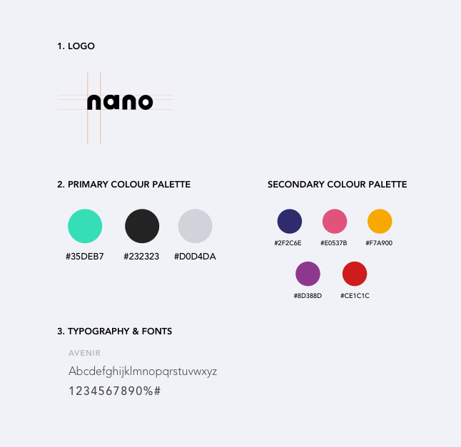
Branding, identity, interface
The interface’s visual balance is kept with a contrasting monochromatic base with bright brand colours used for differentiation in budget categories and spending reports.
With content laid out carefully that ensures clarity in different types of payments and loud calls-to-action guiding the predicted flow for the user in efforts to keep efficiency within the app.

What next?
With the research and prof of concept ready, the Nano team are working to becoming an official partner via an accelerator program by a large organisation. Once this is in motion, Nano has the key screens and style guides to work with in completing other journeys set out from the information architecture and user flows delivered.
